• ADVERTISING
  • BRAND IDENTITY
  • LOGO DESIGN
  • PREVIOUS CLIENTS
  • PRESS
  • About
Menu

my wright brain

CREATIVE DIRECTOR. ART DIRECTION.
  • ADVERTISING
  • BRAND IDENTITY
  • LOGO DESIGN
  • PREVIOUS CLIENTS
  • PRESS
  • About

SUGOI

Sugoi is a DTC brand of luxury skincare. As an online-only disruptor brand, Sugoi required strong design with clear messaging that would garner a devoted cult following of consumers with an appreciation for distinctive and refined branding. Sugoi knew how to use consumer data but needed guidance in leveraging that into a consistent and impactful identity. In the overcrowded beauty industry and growing DTC market the brand graphics stand apart with a watercolor motif to communicate moisture while the converging colors speak to the product’s spirit and usefulness on all skin types. The typography is set in a playful embossed serif in its purest form to convey cleanliness, softness and the fullness of youth. In Japanese, Sugoi loosely translates to “wow” and the brand design aims to live up to its name.

kimwright_sugoi_branding_shadow_3.jpg

BOL AGENCY

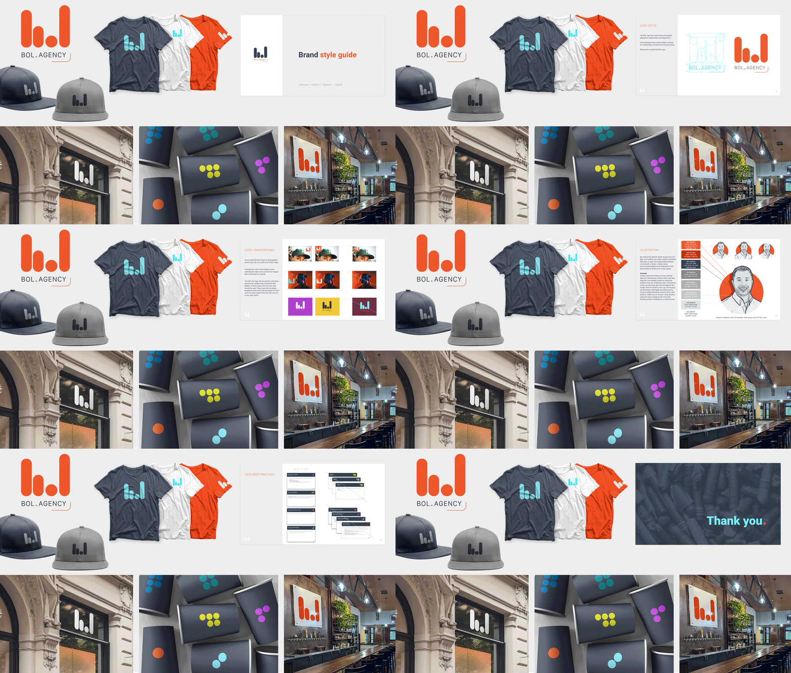
When Kim joined BOL as a Creative Director, her first mission was to rebrand the 20 year old agency so their image better reflected their culture. Before her 1 year anniversary, they had a new moniker, logo, website, deck templates, brand guidelines, and video and ad campaign.

The new BOL mark appears fresh and modern by creating visual interest through a graphic interpretation of b.o.l. The mark represents their success as a results driven agency through an adaptation of a bar graph while the colors give the brand a crisp refresh. When your logo’s inspired by a bar graph, what’s better than a fully stocked bar for your new office space?

kimwright_BOL_branding-2.gif

ONE TEAM

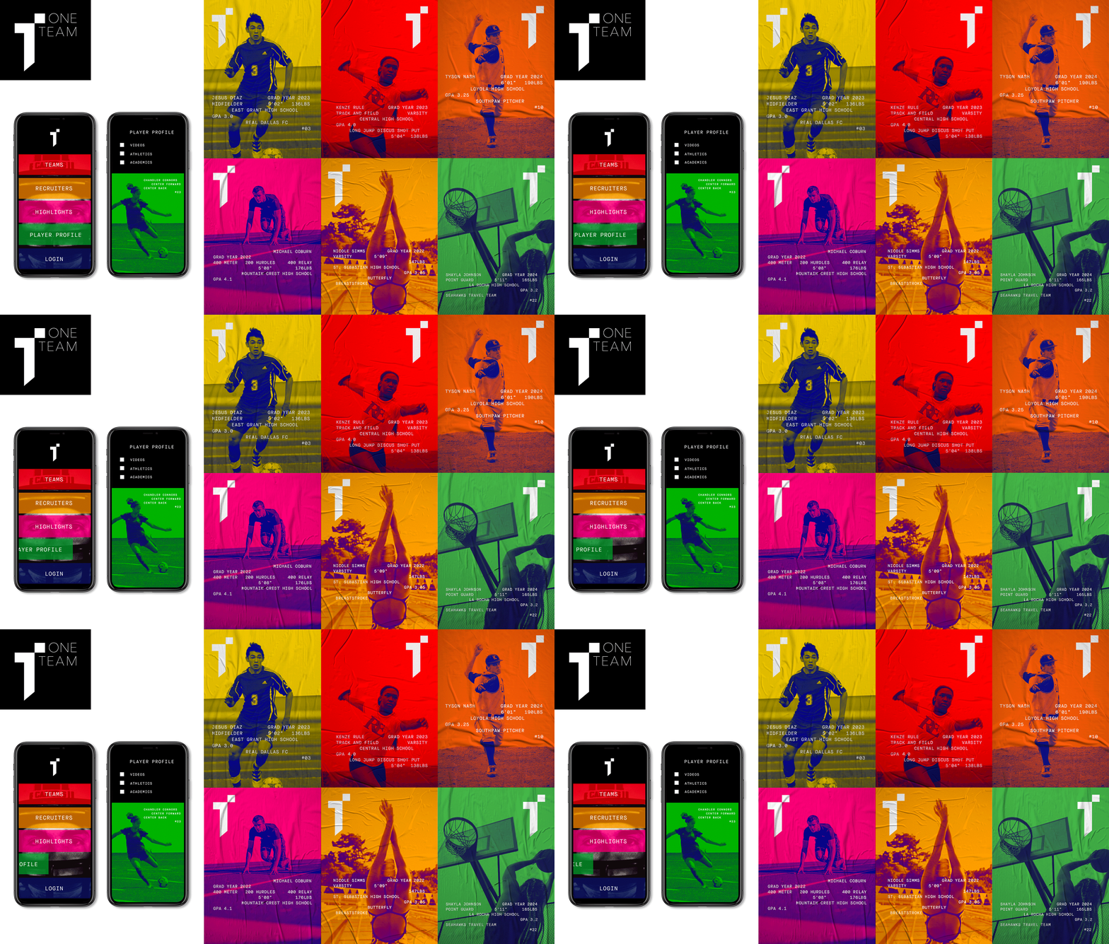
One Team is a digital platform that helps young athletes connect with D1 college recruiters. The graphic system is inspired by the idea that each athlete has their own dynamic story to share. The digital and print graphics are built on the theme of individuality and the unique identities and backgrounds of the One Team athlete pursuing their D1 dream.

kimwright_T_3.gif

KIKI'S KITCHEN

Canadian based food company, Kiki’s Kitchen, began by delivering organic and vegan sauces. The rich colors generated by the all natural ingredients inspired a black and white identity that could enhance the products raw splendor. The challenge was ensuring that the identity had legs that would work as Kiki’s product line grew. This was approached as a branding opportunity by creating a master logo with a whisk illustration that changes to other utensils as they've expanded to chopped salads, baked goods, soups, and entrées.

kimwright_KIKI_branding.jpg

POLITICON

Hatch Show Print has been creating iconic letterpress posters from Nashville Tennessee since 1879. Politicon moving the convention from Los Angeles to Nashville for the first time ever provided an opportunity to draw inspiration from the shop that’s been providing the graphic design landscape of Nashville for over a century. To bring the Nashville aesthetic to the Politicon brand required days of studying the textures, typography, effects, ornamentation, and materials of wood type printing. After four consecutive years working with Politicon, they were much obliged to bring a little southern charm to the print and digital campaign.

bridge13_politicon_2019.jpg
kimwright_politiconnashville_2.jpg
kimwright_politiconnashville_4.jpg

MAIN

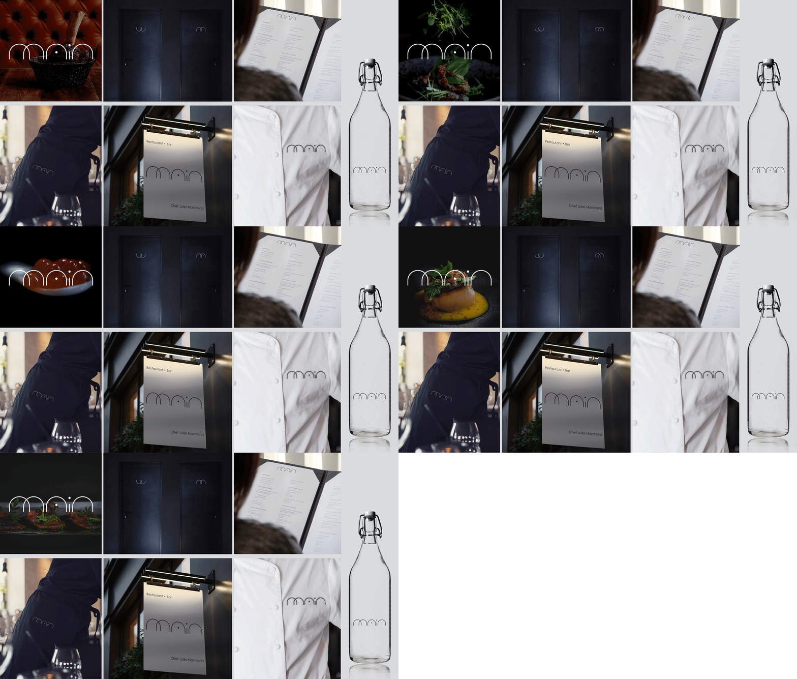
The new identity and branding for Main Restaurant strips away all but the most basic elements. The brand reflects the sophisticated and experimental style and tone of the restaurant’s concept and environment and cleanses the palate of any unnecessary ingredients.

kimwright_main_branding_3.gif

E & H

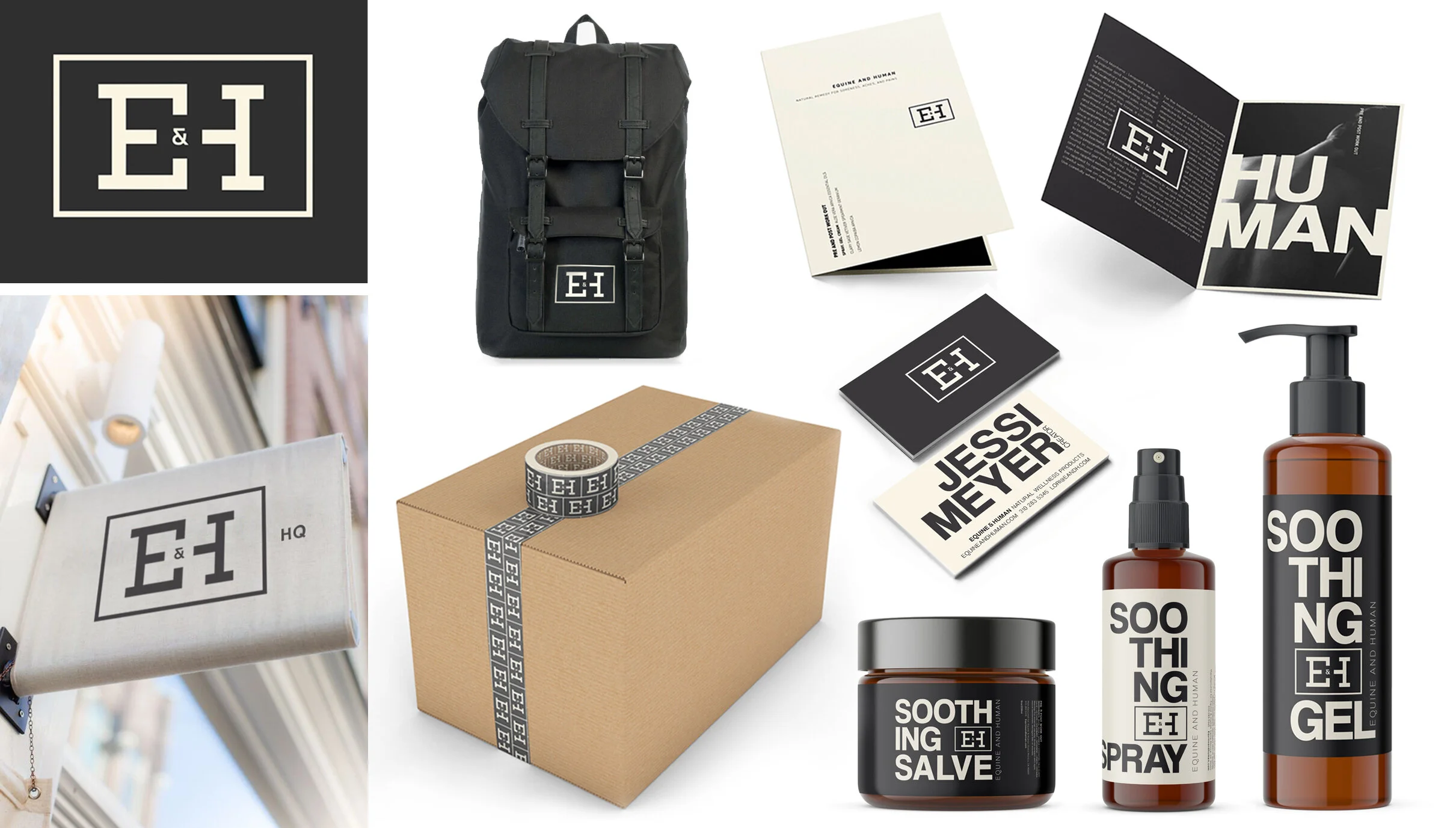
E&H is a natural product line formulated to relieve the pre and post workout aches of the equine and human body. The pleasant fragrance and holistic properties demanded a visual distinction from the Bengays and Ibuprofens in the market. The logo and packaging labels are designed to evoke strength through uncomplicated art direction. With a simple color scheme, bold yet informal typography and no high tech effects or gratuitous elements, the brand is equally soothing on the eyes. 


kimwright_E&H_branding.jpg

SPINFINITY

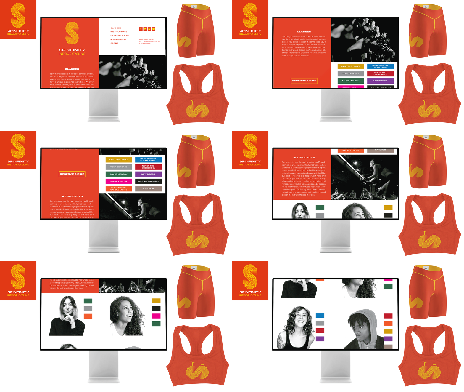
To create the Spinfinity identity, a pattern of lines was constructed to indicate motion. The fluid strokes form the Spinfinity ‘S’ and an infinity sign which becomes the brand’s graphic bike icon when turned on its side. The site design utilizes a color key to provide a clear visual connection that conveniently links the classes to the instructor. The colorful new visual branding has been applied across the website, posters, social media, apparel, and studio environment. All assets emphasize the campaign’s key message, to bring endless joy through indoor cycling. With the right design the possibilities are spinfinite.

kimwright_spinfinity_branding.gif

ORGANIC NECTARS

Organic Nectars is a line of gourmet gelato made from raw, organic cashews and sweetened with Organic Nectars’ own agave syrup. Though the natural foods market is a competitive culinary scene, there's a tendency to go towards plain, bare design, furthering the perception of tasteless products. Organic Nectars needed a strong brand identity to make that niche their own and convey the array of rich flavors.

As well as developing the original mark, the visual identity was defined with the color palettes, illustrations and typography. The drip of the logo is at the heart of the identity and acts as both a punctuation mark and ‘O’ of the word mark. The packaging was intended to create a contemporary and playful aesthetic juxtaposed with the elegance of the new minimalist logotype. Original graphic illustrations swiftly communicate the product flavors while the saturated colors and eye-catching geometric patterns ice out the other products in the market.

kimwright_ON_branding.jpg

SWEET ROLL SWADDLE

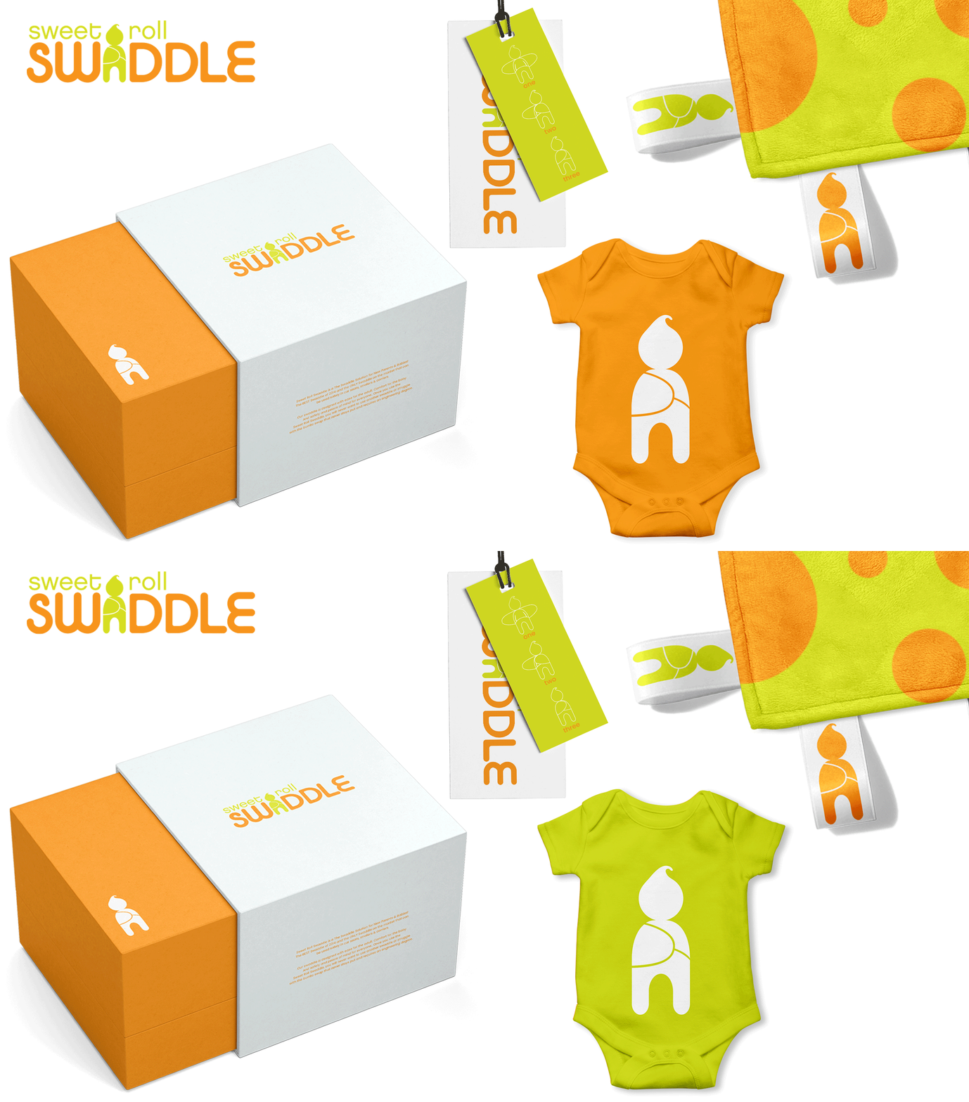
Sweet Roll Swaddle was like many genius ideas. The product was so uniquely clever that the consumer couldn't envision its function. When faced with this challenge, the best way to deliver the concept behind the product is to incorporate its use into the identity. This was an opportunity to develop the Sweet Roll Baby to serve as the brand mark and provide a platform to illustrate the swaddle's application. Form and function in a sweet bundle.

Kimwright_sweetrollswaddle.gif

WOODSHOP

Woodshop is a charming hardware store in the heart of Seattle. As neighborhood hardward shops vanish to corporate giants, it’s important to make Woodshop feel more approachable. To honor the old fashioned, traditional service, the logo incorporates an antique woodworking handtool. The branding focuses on the meticulous details to perfectly portray the small but mighty shop’s love for the craft.

Kimwright_WOODSHOP_branding.jpg

24 HOUR HOME CARE

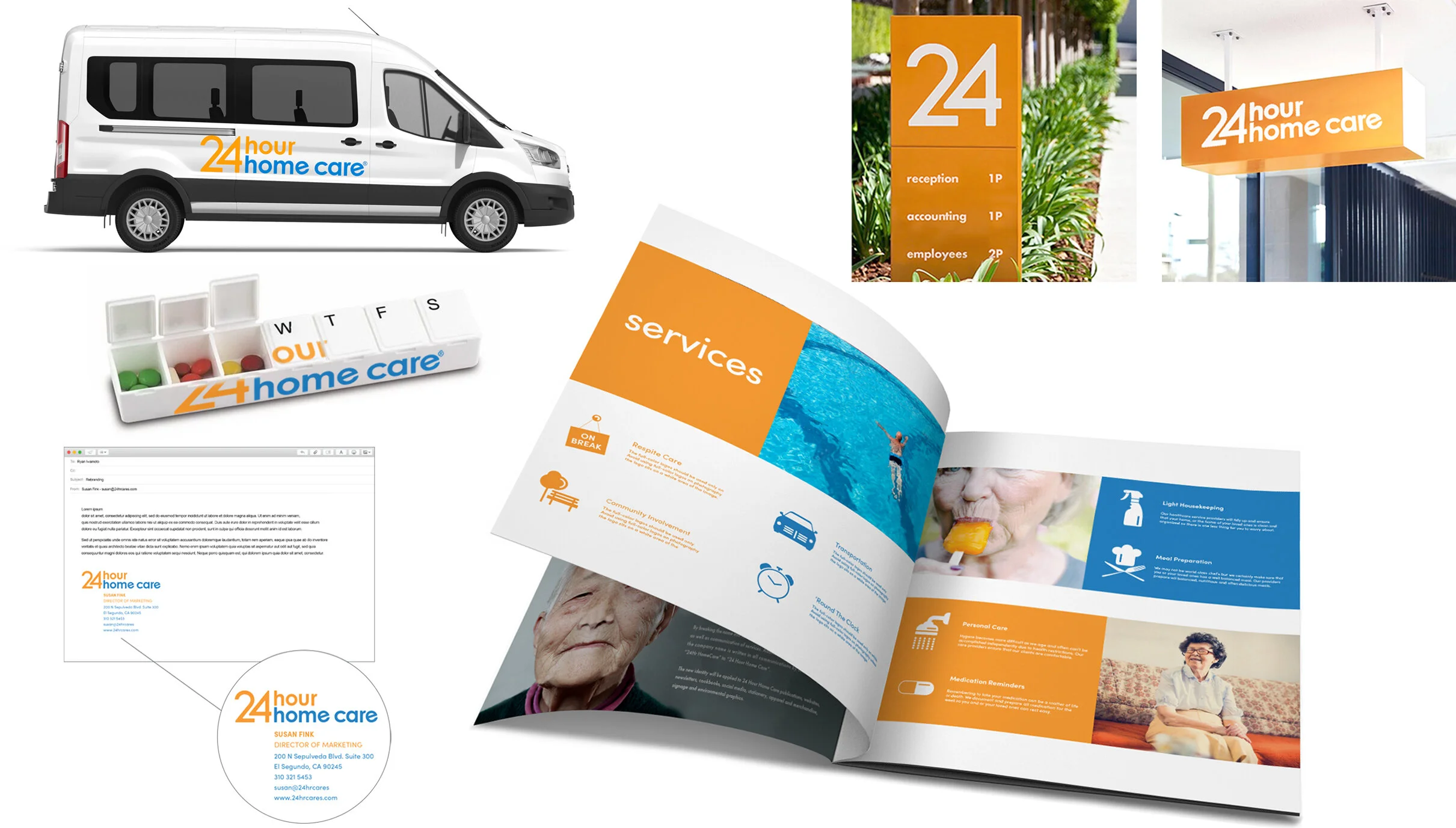
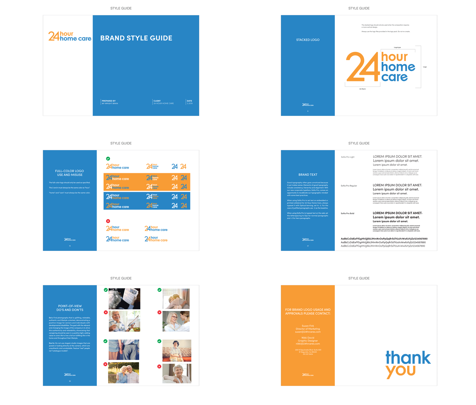
24 Hour Home Care is one of the most trusted brand names among home care providers. Logos within the aging care market either look overtly medical, or in an effort to appear warm and friendly, overreach and become too playful by incorporating hearts or trite clipart. These visuals only downplay the gravity of their client’s predicaments and don’t portray professionalism and erudition. To commemorate their 10 year anniversary, 24 Hour Home Care wanted a new identity that wouldn’t disrupt their brand equity. By working closely with the 24 Hour founders and marketing team, the company’s spirit of affability was captured with a fresh color palette and custom typography. While utilizing the existing shade of blue, the warmth of caregiving was conveyed by introducing a secondary orange and slightly rounding the corners of the letterforms. A comprehensive program of iconography was incorporated by maintaining a clean and modern aesthetic throughout the brand to further deliver as a user friendly resource. 

kimwright_24HourHomeCare_branding.jpg
kimwright_24HHC_branding_3.jpg
kimwright_24HHC_STYLEGUIDE.gif

BAIT

Bait Fishery was a new storefront looking to differentiate themselves from the typical fish market. Catering to distinguished sushi chefs, celebrity chefs and the foodies of Manhattan meant creating a logo and branded content that didn’t conjure up fish-throwing and scale laden floors. While the branding process can sometimes feel like swimming upstream, the open mindedness of the Bait team made for smooth sailing.

kimwright_bait_branding.jpg

CIRCUS BEAR

When Circus Bear Winery looked to rebrand, the inclination was to give the brand a more handcrafted touch by incorporating an intricate illustration. A new identity of custom typography and a winsome illustration is surely worthy of a toast.

kimwright_circusbear_branding.jpg

BX RANCH

BX Ranch is a 45 acre farm in Central Oregon. The high-end facility accommodates visitors in various outbuildings including a tiny home, yurt, historic silo, and treehouse. In addition to boarders, the ranch hosts weddings, community gatherings and music festivals. Guests can enjoy the mountain view and savor cocktails featuring the BX distilled whiskey around the lodge hearth and campfire.

The design process began by addressing the client’s request for “a simple, modern logo with the feel of a cattle brand” by creating a fixed, interlinking typeface. The negative space at the center of the logo introduces an element of visual surprise with a house silhouette to carry the message of hospitality. On top of the BX Whiskey brand, the ranch’s gardens and resident chickens yield produce and fresh eggs sold through the BX Farmstand label. This provided an opportunity to give the different product lines their own identity by incorporating a bold color. In combination with the original logo, a comprehensive brand identity was developed to juxtapose chic design with homespun materials. Drawing on the rustic environment to create a visual personality has the makings of a real barn burner.

kimwright_BX_branding.jpg
kimwright_BX_branding_2A.jpg

ORE STUDIO ARCHITECTS

The updated brand identity for Ore Studio needed to highlight the family-owned company’s culture of excellence as a leader in luxury architectural design since 1940. Research showed that most people remarked on the tasteful and visionary aspects of Ore’s projects. The design strove to build on this foundation of a marriage between elegance and technology. The new look is elaborate and modern and speaks to the firm’s most powerful attributes while staying true to its core values and strengths.

kimwright_ore_branding.jpg

GIRL CODE *

Girl Code aims to close the gender gap within the computer sciences by offering coding classes and camps to girls ages 7 to 17. The design aspires to change the perception of programmers. By staying clear of overt STEM symbolism and simply utilizing exhuberant typography and playful tones, Girl Code’s identity embodies the fun aspects of tech while letting girls be girls.

kimwright_girlcode_branding.jpg

INARI AGRICULTURE

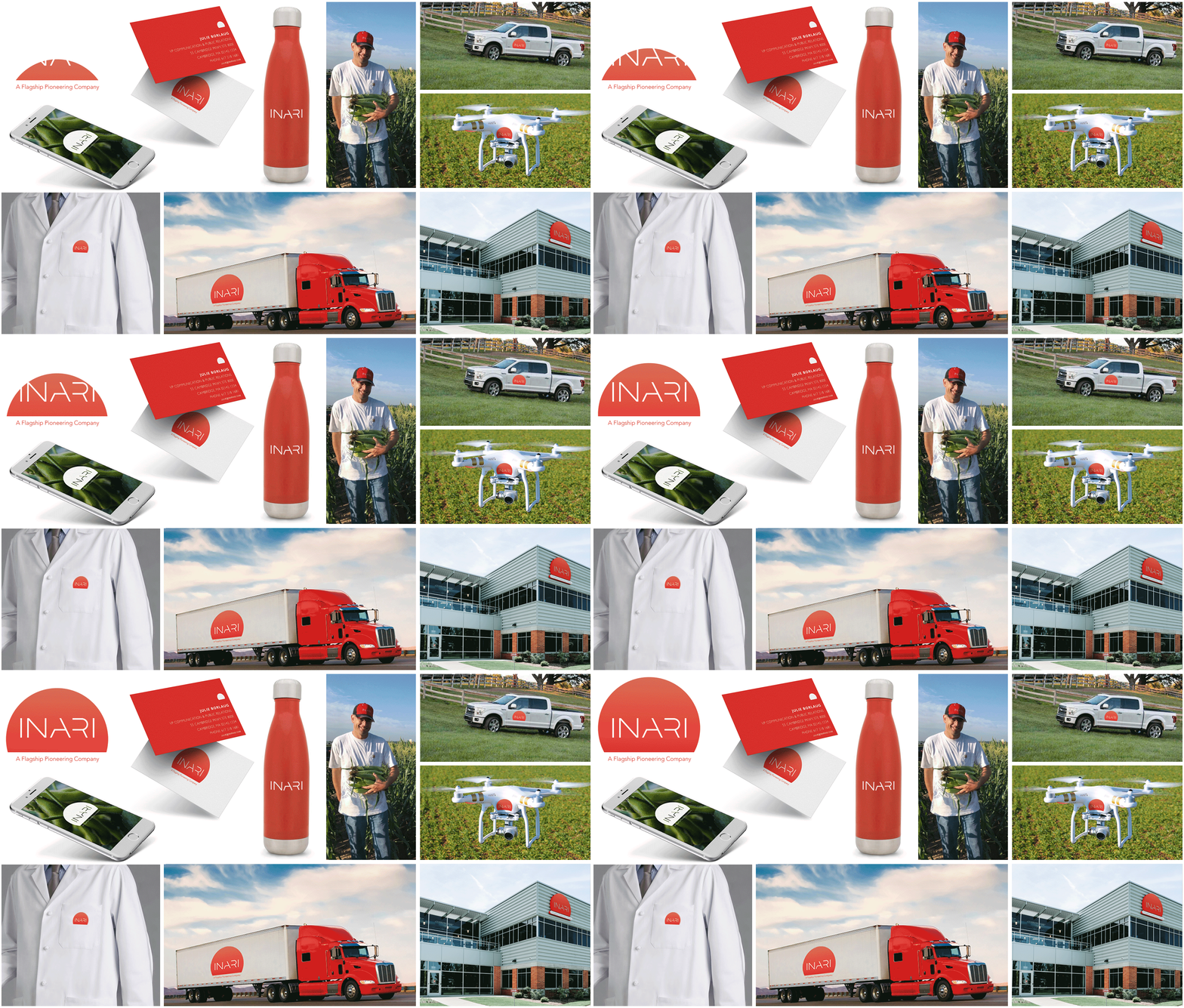
Inari is a Boston based startup looking to disrupt the field of agriculture technology. As consumers pay more attention to where their food comes from, Inari intends to put more pressure on the current players in the agriculture production sector by being more environmentally friendly. A new agribusiness seeking technological ways to make farming easier on the farmers and the environment requires an identity that reflects this philosophy. A minimalist, custom typeface was designed along with a gradated brand mark to represent their position as a rising sun on the horizon. While most can’t claim to understand the science of biotechnology, the Inari logo and branded content will plant the first seeds toward progress.

KIMWRIGHT_Inari_branding_6.gif

JOE MAK FILMS

Joseph Makkar's larger than life persona is expressed in his writing and directing and he needed a designer to play a supporting role. It’s not customary to feature a client’s likeness as the brand mark but most clients aren’t a 6’3” Egyptian American whose signature style is a fedora and cigar. The illustration framework is a bold, graphic portrait that emphasizes Joe’s striking features through a stark interpretation. The unadorned type treatment and image allow the group’s productions to take center stage. The final identity has a horizontal and vertical configuration intended to introduce the audience to the person behind the project just as the line drawing for Alfred Hitchcock Presents did so many years earlier.

bridge13_JOEMAKFILMS_branding.jpg

LORIANN SHAPIRO

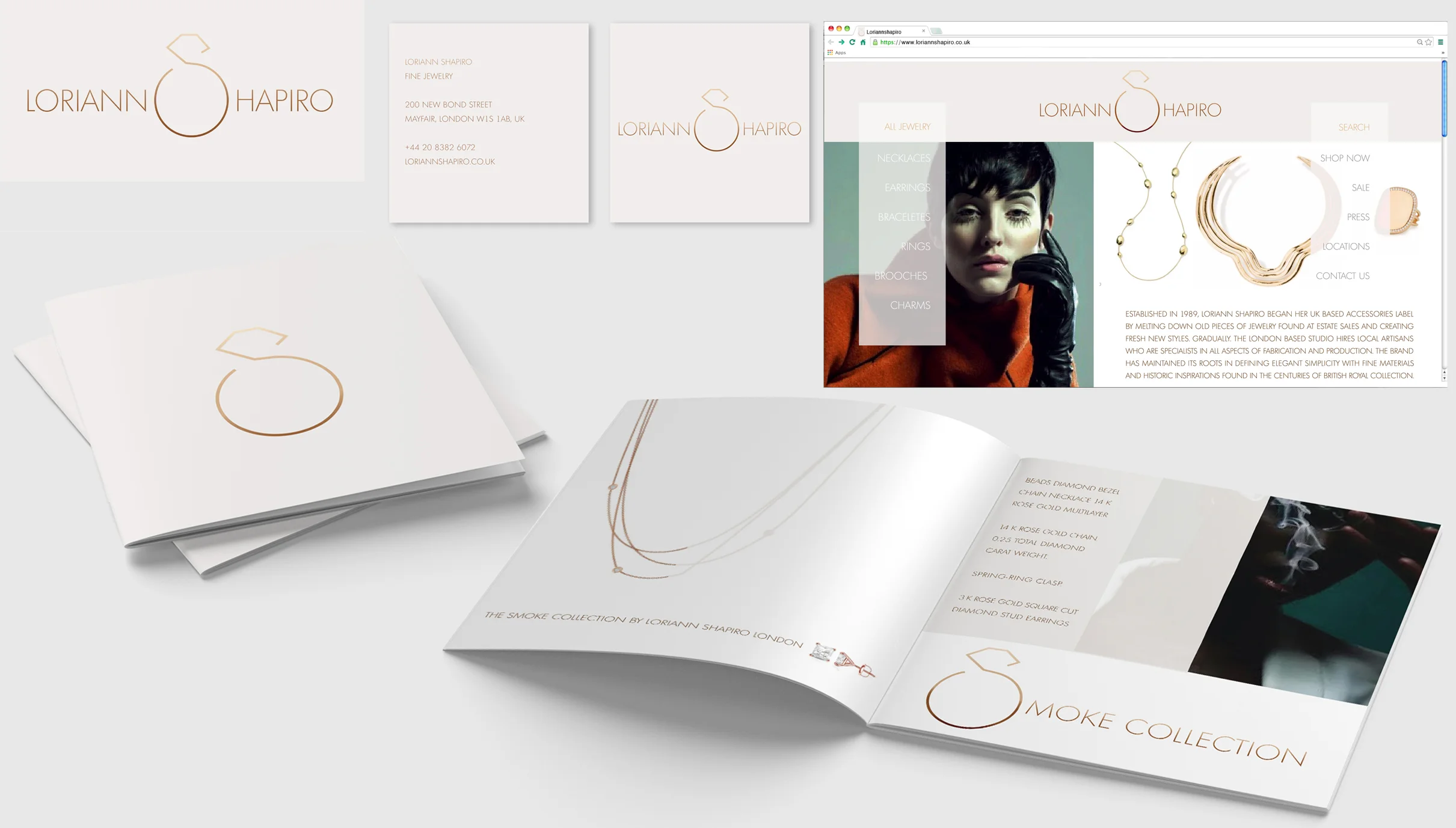
When Loriann Shapiro looked to rebrand she'd already enjoyed nearly 30 years as one of London's top jewelry designers. In order to bring her high end reputation to a broader audience, an online presence and a brand new identity were developed to be more in keeping with the company’s in vogue designs. Through a fresh logo, revived photography and art direction, the 30 year old brand sparkles like new.

LS.branding.flat.jpg

INVAIO SCIENCES

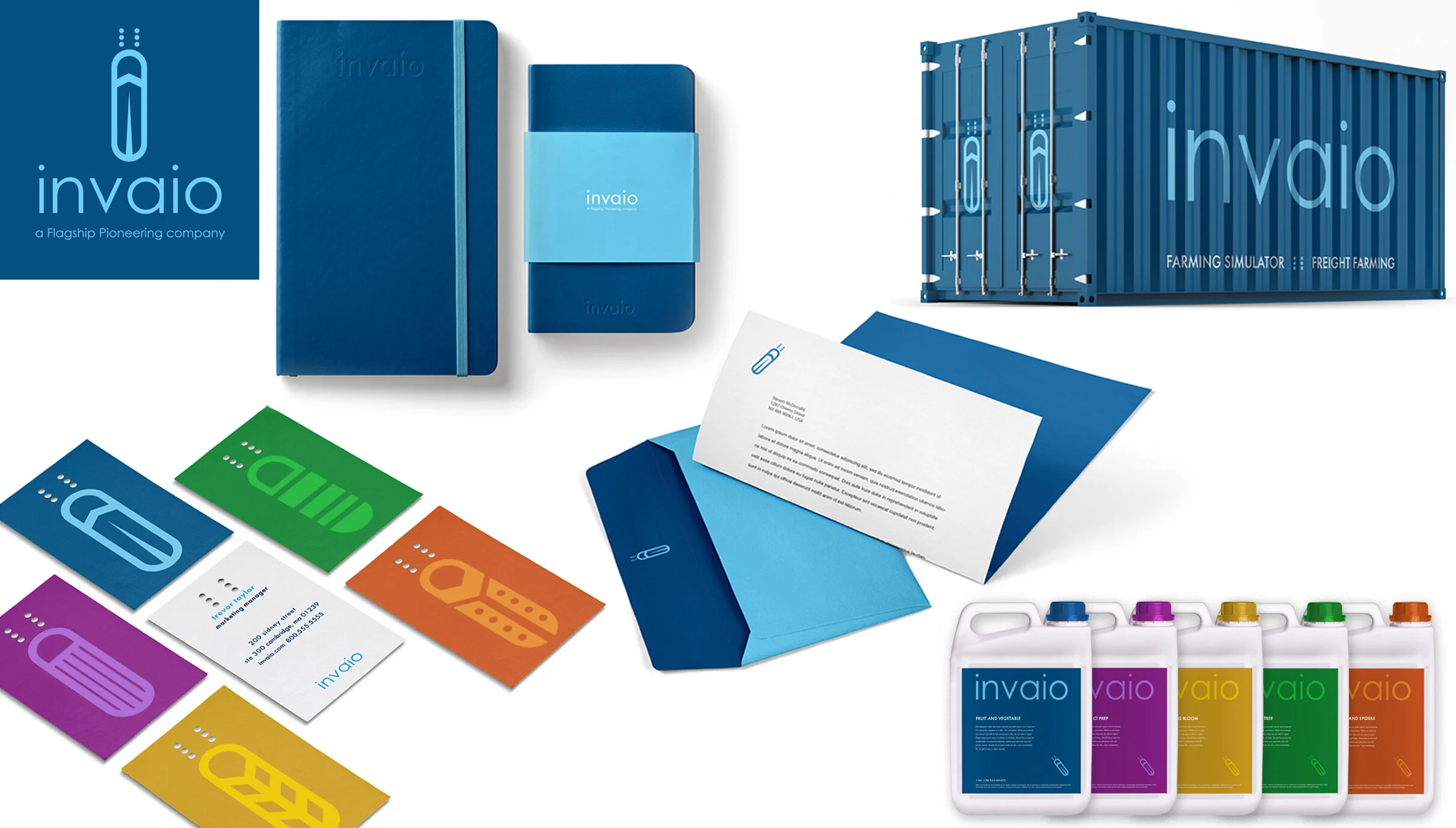
Invaio Sciences is a Cambridge startup developing the chemical preparation for the control of insects for agricultural use. Invaio’s mission is to promote insect health through chemical agents. Developing an identity that avoided the unnerving imagery that’s associated with traditional insecticides meant creating a nonthreatening insect for the brand mark. From there, a brilliant color palette was built around simple typography. Building a positive identity for Invaio as they seek a positive future for the ecosystem was the goal. Saving the diminishing bee population doesn’t bug them either.

kimwright_invaio_branding copy.jpg
prev / next
Back to BRAND IDENTITY
1
SUGOI
image-asset.jpg
2
BOL AGENCY
1
ONE TEAM
1
KIKI'S KITCHEN
3
POLITICON NASHVILLE
1
MAIN
1
E & H
1
SPINFINITY
1
ORGANIC NECTARS
1
SWEET ROLL SWADDLE
1
WOODSHOP
3
24 HOUR HOME CARE
1
BAIT
1
CIRCUS BEAR
2
BX RANCH
1
ORE STUDIO ARCHITECTS
1
GIRL CODE *
1
INARI AGRICULTURE
bridge13_JOEMAKFILMS_branding.jpg
1
JOE MAK FILMS
1
LORIANN SHAPIRO
1
INVAIO SCIENCES